I didn’t set out to build a website with AI.
I set out to design a company website that felt credible, enterprise-ready, scalable, and accessible, and to do it in a way that preserved design intent from the first decision to the last line of code.
AI-assisted prototyping has already been part of my workflow for a while. I’ve experimented with tools like v0, Lovable, Replit, Cursor, and most recently Claude Code. Over time, my relationship with these tools shifted—from relying on AI-generated components that felt generic, to using AI in a way that still allowed me to take authorship, with AI amplifying the process rather than driving it.
This project became a way to explore that shift more intentionally.
Why I built the website this way
When I think about websites, I don’t think primarily in pages. I think in terms of tone, hierarchy, constraints, and how decisions hold up as the system grows.
I had already built one version of the site using Cursor, which worked well as an exploration. But after deploying and spending more time with it, I started to notice issues I had missed earlier around motion and consistency. The homepage felt finished, but the experience became more fragile as soon as I moved beyond it.
I wanted a workflow that could:
- Start with design clarity
- Scale beyond a single page
- Stay lightweight and accessible
- Avoid the templated or “AI-generated” feeling that’s becoming easier to recognize
That’s when I stopped thinking about this as a website project and started treating it more like designing a product system.
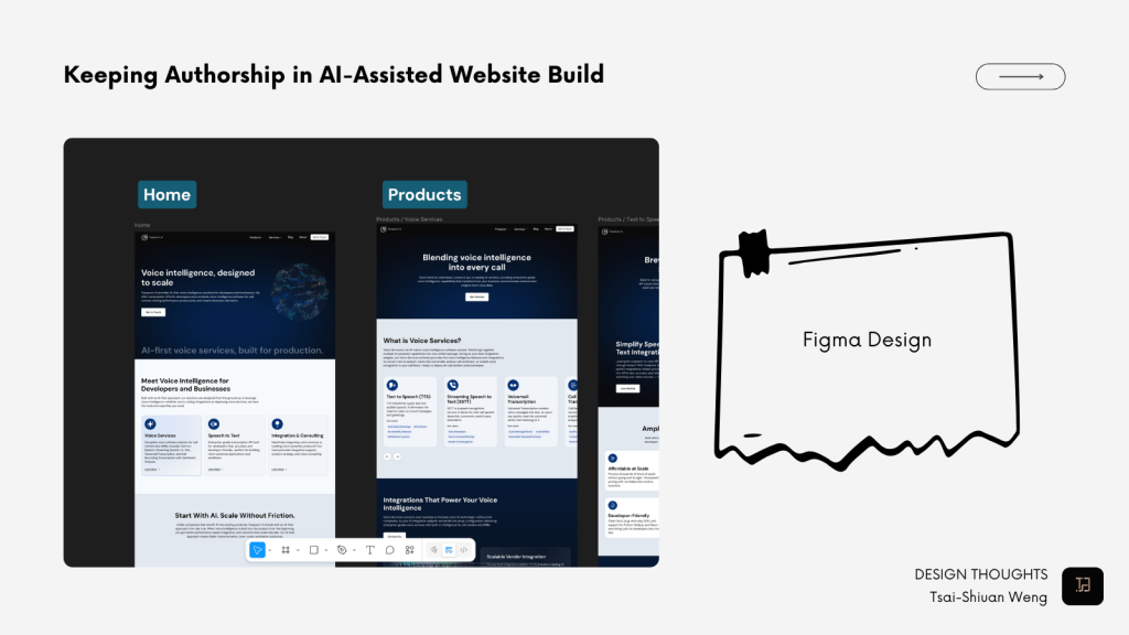
Starting with Figma as the system, not the mock
The most important decision I made early on was this:
Figma would be the source of truth, not just a reference.
I started with the homepage, using it to establish:
- Visual tone
- Typography hierarchy
- Color usage and restraint
- Spacing and layout rhythm
- Reusable component patterns
Very quickly, I added a second page: a product page. This was intentional. Designing a product page early forced me to think through:
- Information density
- Layout scalability
- Accessibility in more complex content
At that point, I wasn’t really designing screens anymore.
I was designing constraints—and using those constraints to guide everything that came after.
The framework decisions I made
Early on, I experimented with Cursor using Sonnet 4.5, which worked well for ideation and quick iteration. But once the overall direction became clearer, tooling choices started to matter more.
For a SaaS product, prototyping with Next.js as a frontend-only setup makes a lot of sense. For this website, though, it felt heavier than what I needed. There was too much abstraction for a mostly static site, and some design decisions started to feel buried under framework conventions.
I eventually moved to Astro. Its static-first approach and content-focused model felt like a better fit, while still allowing me to adapt React where needed. Most importantly, it lets the structure and design decisions stay visible in the code, rather than hidden behind layers.
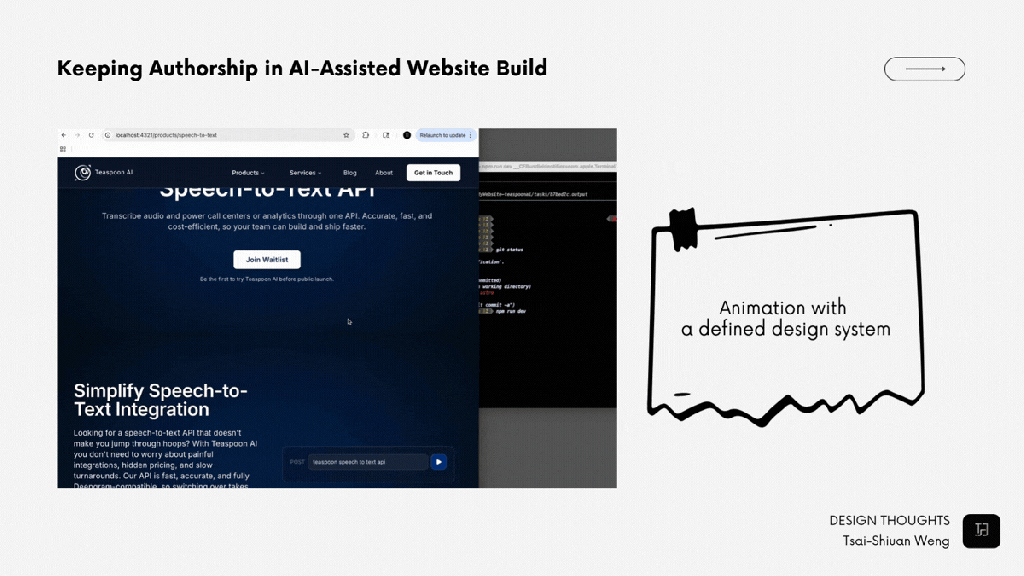
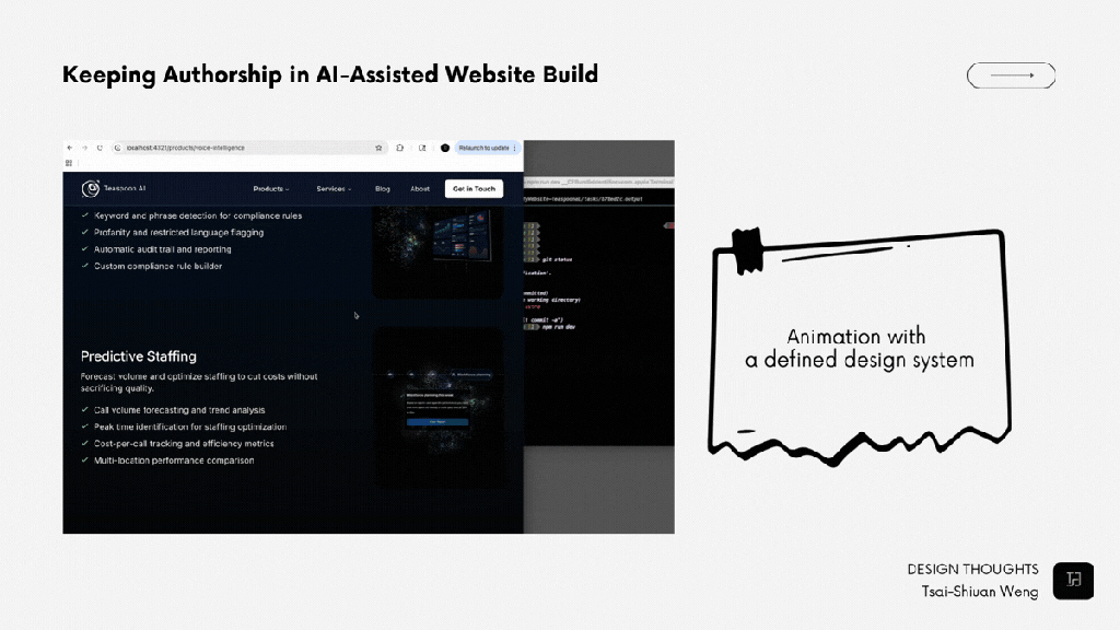
From Figma to production, and taking authorship
Early in the process, I used Figma MCP to explore different design directions and ideation paths. Once I felt confident about the tone, layout logic, and component patterns, I shifted to working directly with Claude Code in the terminal.
At that point, I wasn’t asking AI to design anything.
I was asking it to:
- Extend existing patterns
- Generate additional pages and sections
- Match a defined system as closely as possible
As I set a clearer design discipline, I noticed I could also prompt more effectively. Being specific and explicit—much like presenting a design to a team—made the output more aligned and more useful.
Some principles I kept coming back to:
- No default components.
Nothing shipped just because a tool suggested it. Every section is tied back to a decision already made in Figma. - Repetition over novelty.
I reused spacing logic, motion patterns, and hierarchy intentionally. Consistency tends to read as confidence, especially in more enterprise-oriented contexts. - Human-chosen imperfection.
I allowed asymmetry, let whitespace breathe, and avoided overly optimized layouts that can feel algorithmic. - Editing more than generating.
AI produced drafts, but I spent more time cutting, refining, and reshaping. The final quality came from subtraction, not generation.
AI made it faster. Editing made it mine.
What this process taught me
This project helped me better understand how AI can amplify clarity.
When a design system is vague, AI tends to fill the gaps with defaults. When decisions are clear and intentional, AI can accelerate execution without distorting the original intent.
The site feels human, not because I avoided AI, but because I didn’t let it decide for me.


